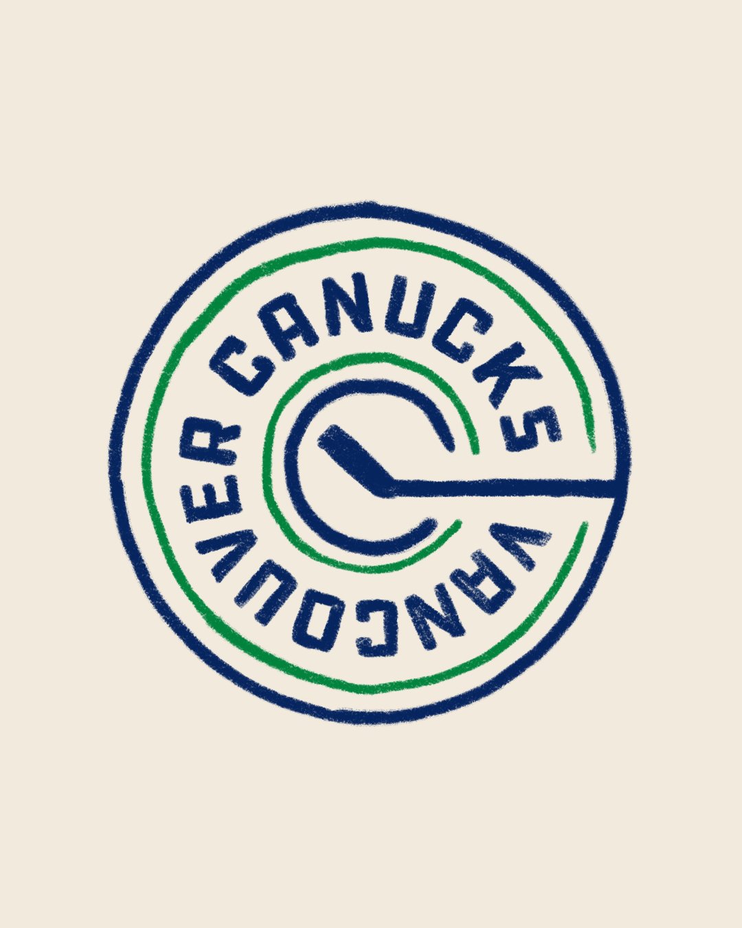
Colouring Book Collection
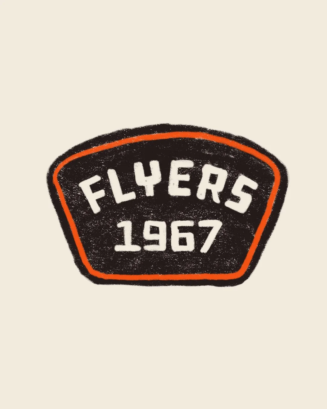
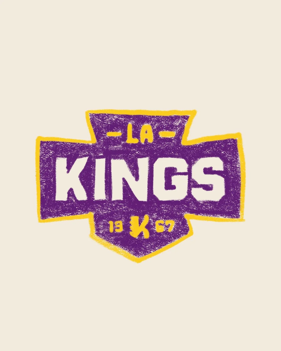
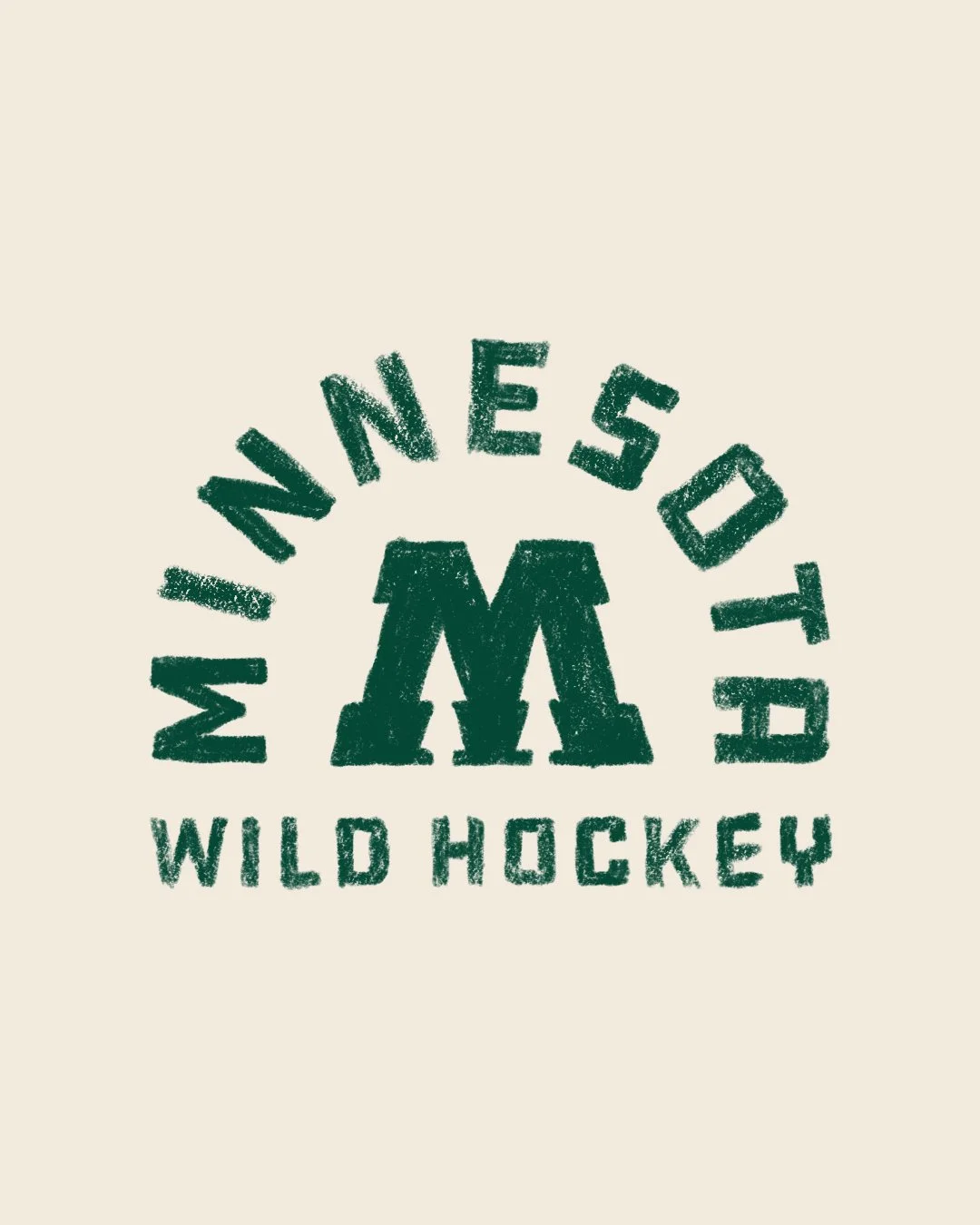
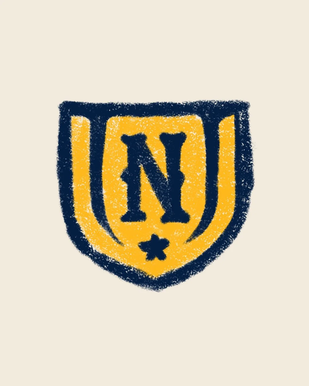
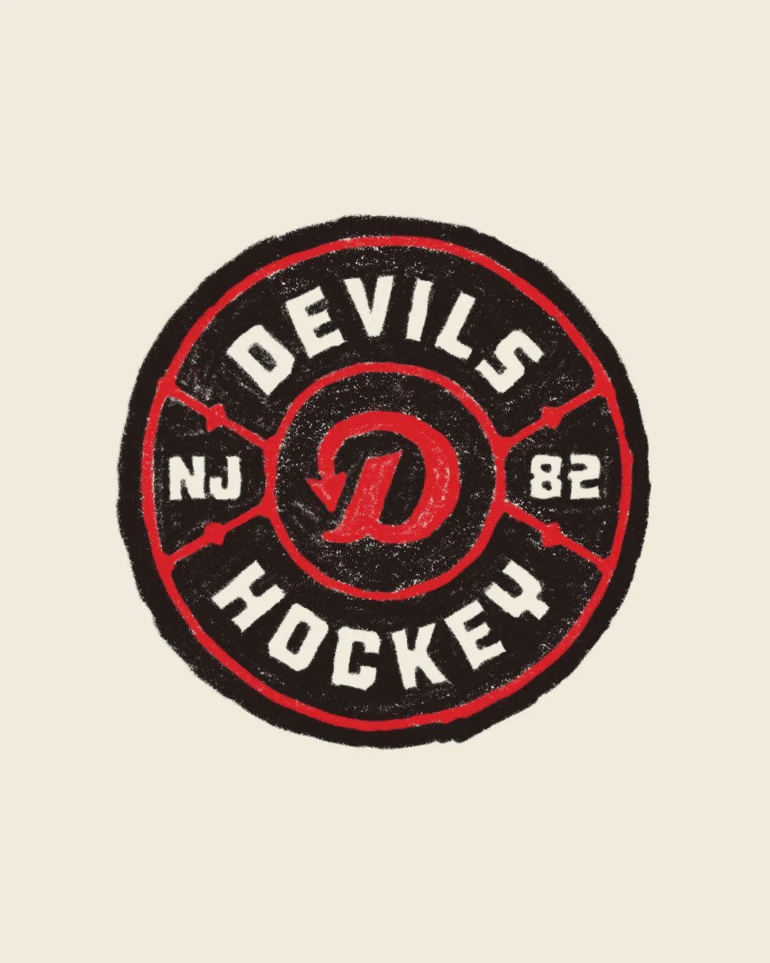
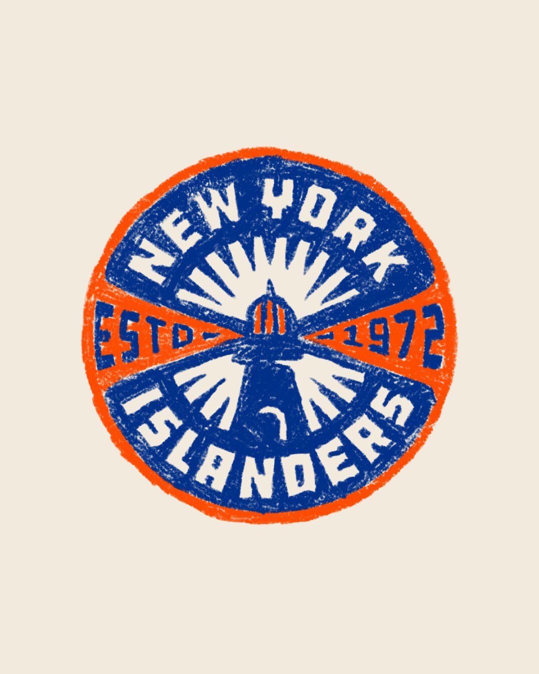
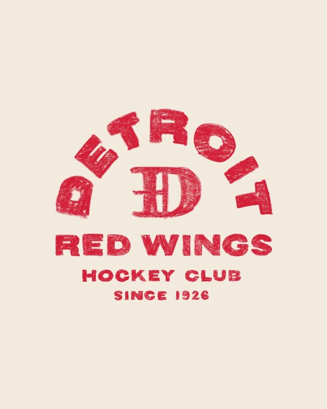
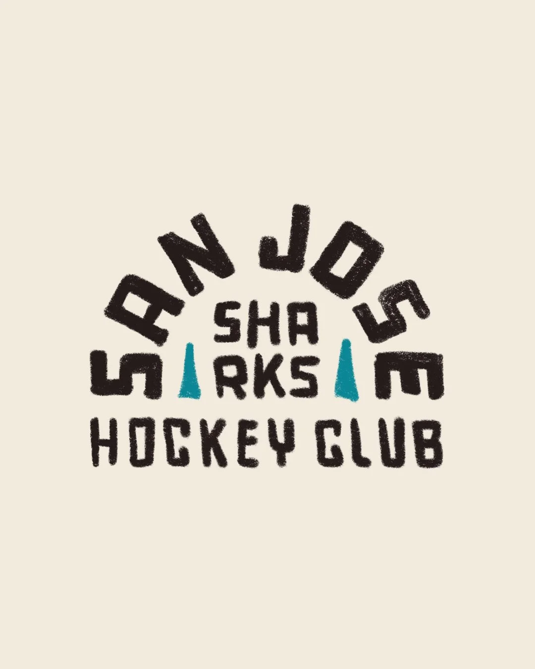
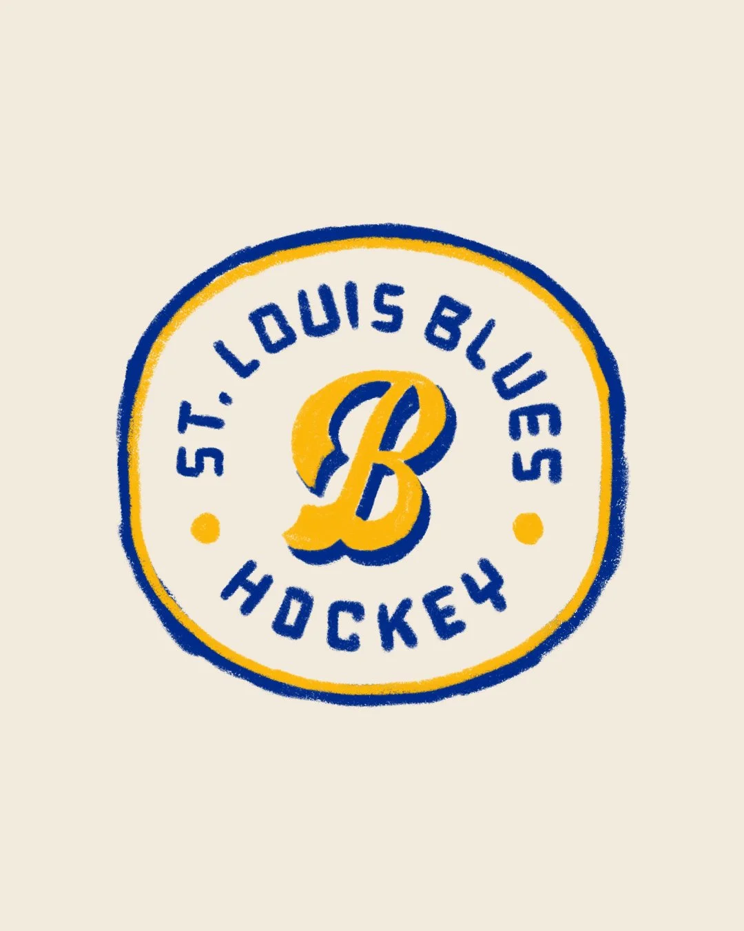
Over the last few years, I’ve become known for clean lines, tight geometry, and polished details in my NHL badge collection. I still loved working that way, but I started feeling curious about the other side of things. I wanted to try something more expressive and human made. Almost like the feeling you get when you’re a kid colouring and you’re not worried about perfect edges.
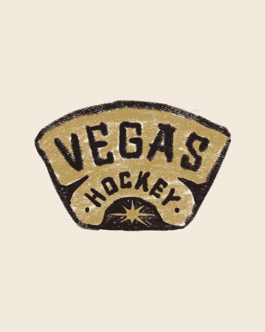
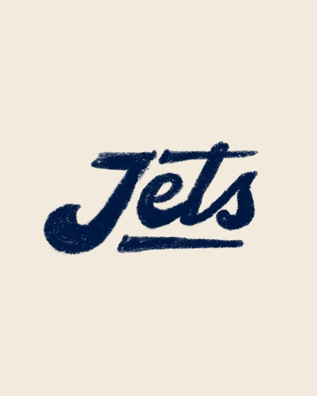
So I started a little design exercise. I took some of my favourite badges from the collection and redrew them in Procreate using a single crayon brush. I set a few rules for myself. No resizing the brush. No zooming in. No erasing. Just colour at a normal scale and let whatever lines showed up become part of it. The goal was to loosen up a bit and see how these designs held up when the precision was stripped away.
It ended up being a mix of a creative challenge and something therapeutic. As I kept going, I noticed a shift in how I worked. At first I was careful and slow, still trying to make clean lines even though I had set rules that were supposed to stop me from doing that. But the more badges I did, the more relaxed I became. By the end I was colouring freely and making marks without thinking too much, and it felt surprisingly good.
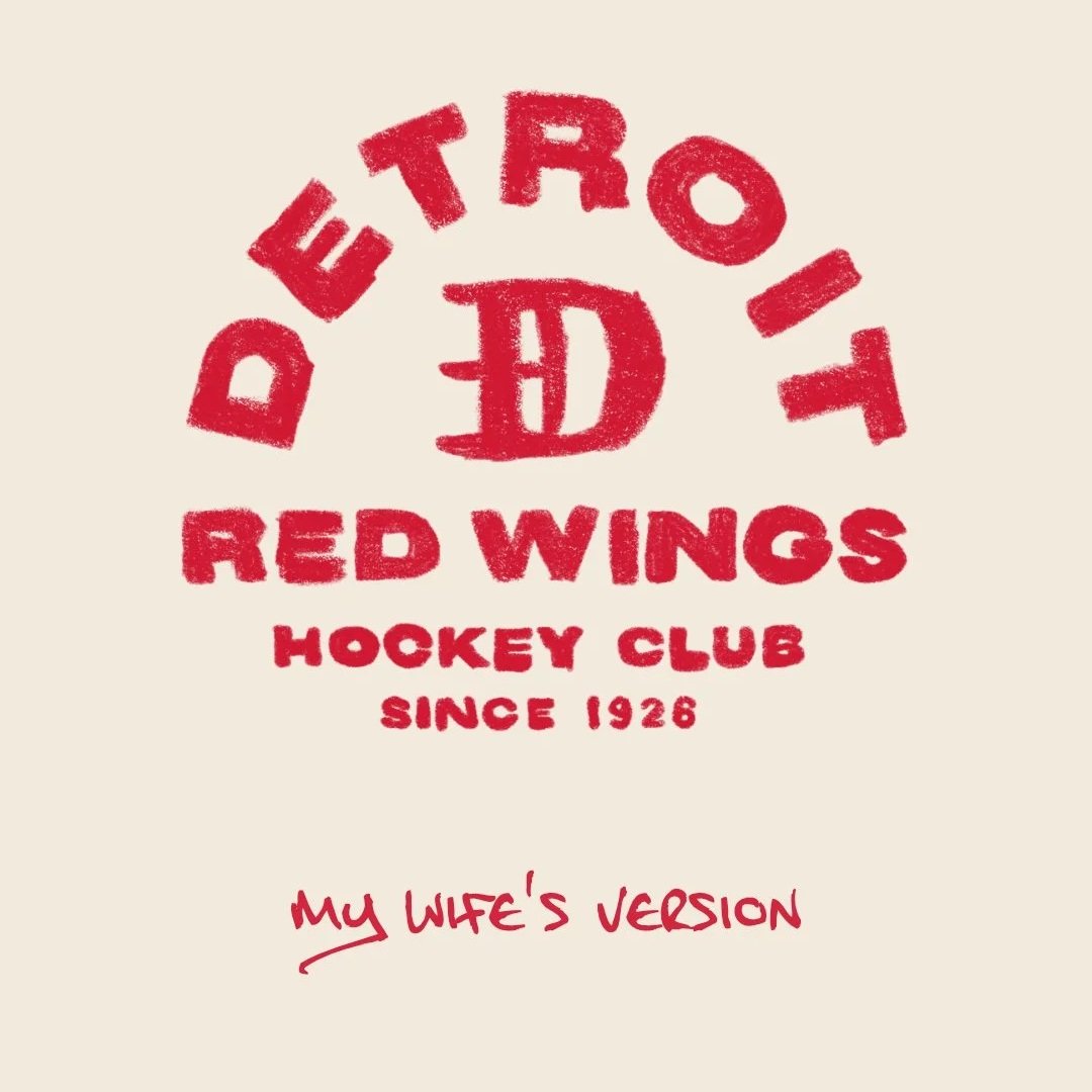
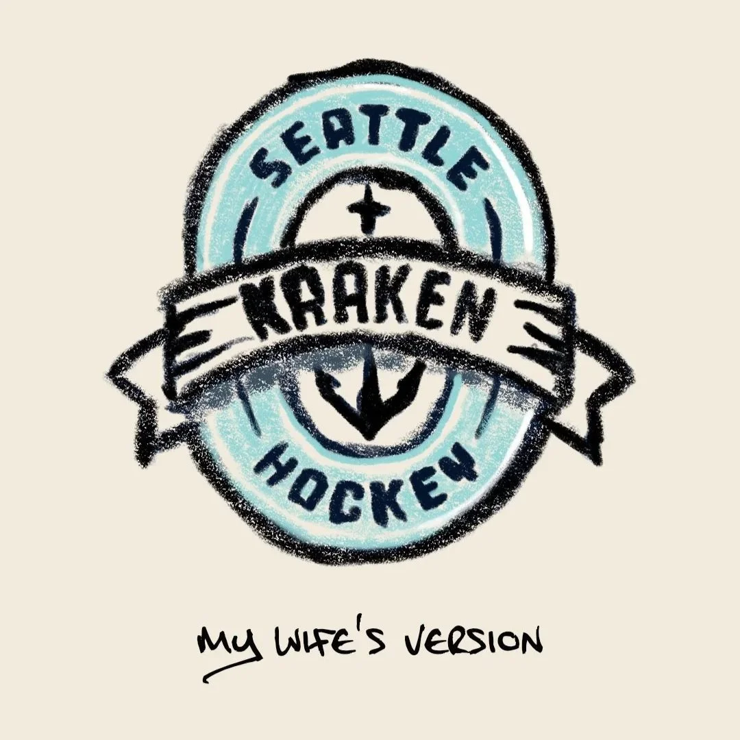
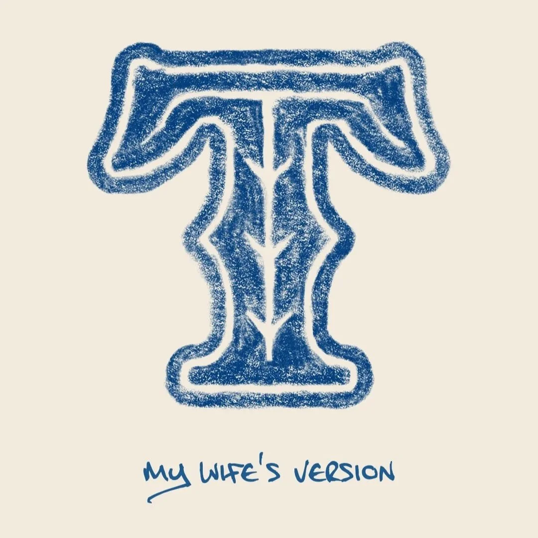
What I did not expect was how much I would like the rougher results. Some of them had so much character that I could genuinely imagine wearing them on a shirt. I even had my wife try a few, and seeing her take on some of my designs was a really fun moment. For something that seemed so simple on the surface, this exercise taught me a lot and reminded me why I love creating.
This was me exploring that side of the process again. And these were the results.