My Process
This section explores the creative process behind my NHL concept series. For each team, I follow a consistent approach that starts with deep research into the team’s visual history, identity, and city. From there, I build mood boards, sketch rough concepts, and explore layout ideas before moving into digital refinement. Each badge is shaped by history, experimentation, and detail, resulting in a final design that feels both fresh and familiar.

Negative Space
The Minnesota Wild lettermark is my personal favourite in this collection as it represents the pinnacle of what I strive for in design. At its core, this design is extremely simple, yet it embodies a seamless hidden meaning that captures the essence of the team and its home. The bold “M” serves as the centrepiece, with the negative space cleverly shaped into two trees. These trees symbolize the natural beauty of the Wild’s identity and the Twin Cities, where the team is rooted.
Process below.
-
![Official Minnesota Wild logo featuring a forest landscape, river, and sunset shaped into a wild animal head]()
Official Wild Logo
The Wild’s logo is a beautiful design, full of hidden elements, which inspired my own design featuring negative space trees.
-
![Rough sketch of Minnesota Wild concept logo by Luc Sauve featuring an M with negative space pine trees]()
Original Sketch
Like all my sketches, this was quick and rough, capturing the idea of an M with hidden pines.
-
![Refined Minnesota Wild concept logo by Luc Sauve featuring a bold green M with clean negative space pine trees]()
Digital Iteration
The digital phase began with basic shapes, using the sketch as a guide to block out the structure and overall form.
-
![Simplified Minnesota Wild concept logo by Luc Sauve featuring a geometric M with negative space pine trees]()
Simplified Tree Shapes
The initial design felt too complicated, so I pulled things back and simplified the tree shapes for better clarity.
-
![Minnesota Wild concept logo by Luc Sauve featuring a bold M with stylized negative space pine trees and slab serif details]()
Added Slab Serifs
The mark needed more of a classic sports feel, so I added heavy slab serifs to the top and bottom of the M.
-
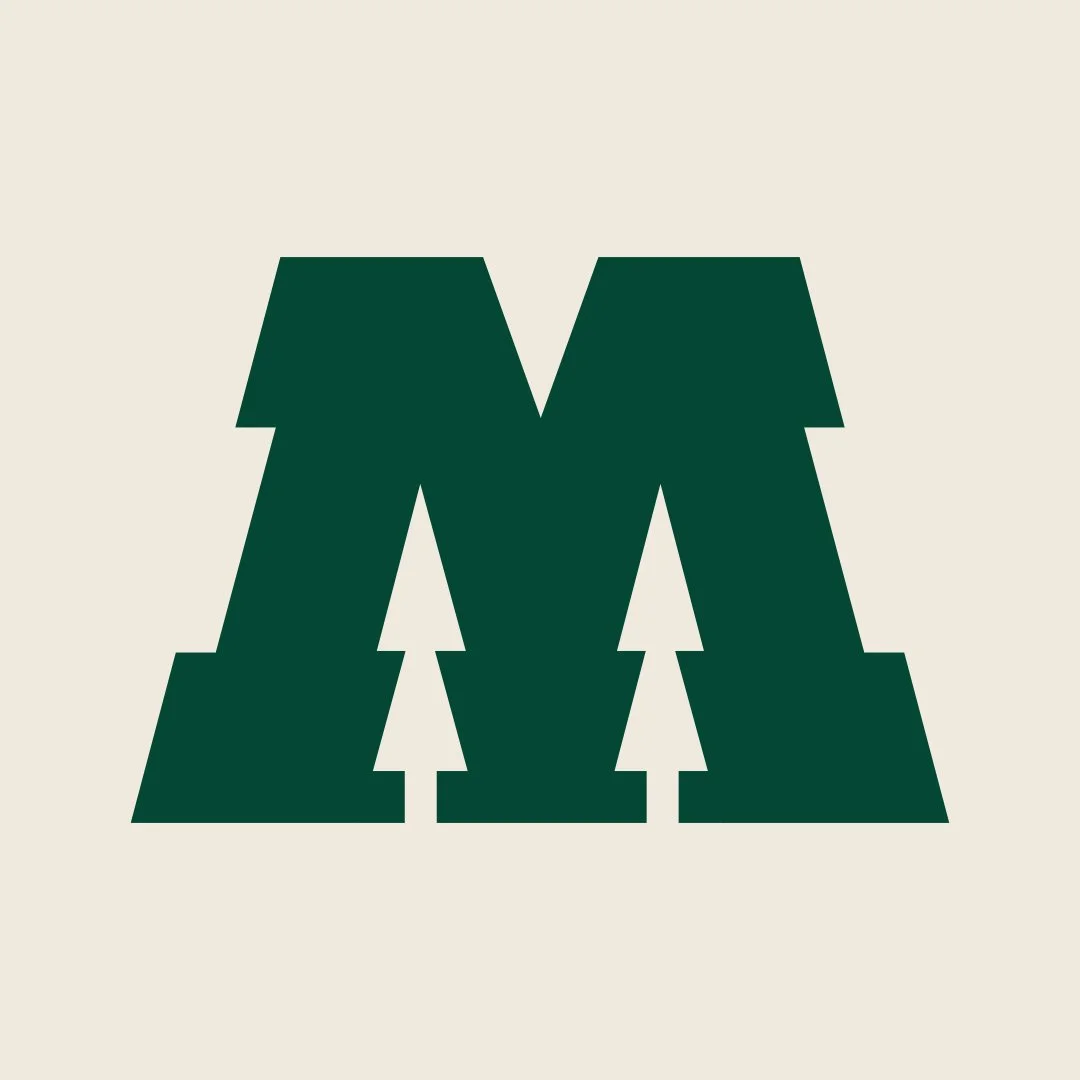
![Minnesota Wild concept logo by Luc Sauve featuring a bold green M with simplified negative space pine trees]()
Added Tree Trunks
This is when the design really started to come together. Adding tree trunks helped clarify the concept. Before this, most people didn’t even notice the trees.
-
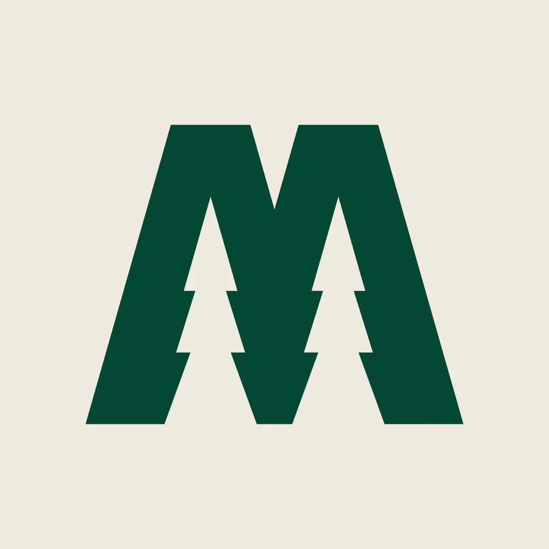
![Final Minnesota Wild concept logo by Luc Sauve featuring a bold M with refined negative space pine trees and outlined details]()
Final Design
The trees needed to be green, so I added a stroke and expanded the base colour. This was the subtle touch that made this design.


Unique Shapes
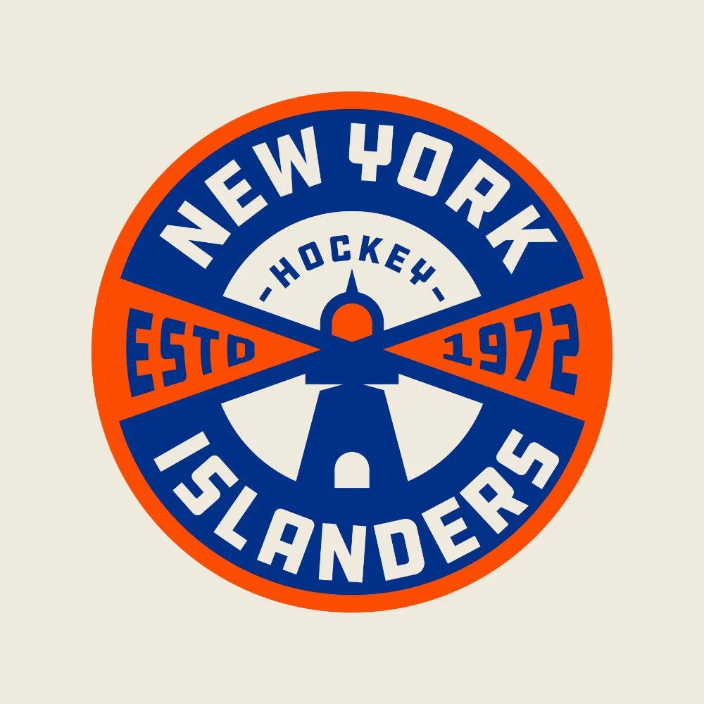
The New York Islanders lighthouse badge concept embodies everything I strive for in badge design: composition, balance and uniqueness. What sets this design apart is the creative use of the lighthouse’s light rays, which seamlessly form the holding shape for the established date. Of all my badge designs, this one feels especially fitting for the Islanders, thoughtfully balancing their history with a fresh perspective.
Process below.
-
![Original New York Islanders lighthouse logo featuring bold colours, ocean waves, and radiating light beams]()
Official Islanders Secondary Logo
In 2023, I was commissioned by the New York Islanders to create brand assets. My badge design was inspired by their lighthouse shoulder patch, reimagined with a fresh perspective.
-
![Initial sketch of New York Islanders concept logo by Luc Sauve featuring a lighthouse and radiating light beams]()
Original Sketch
This sketch was simple, but the idea of using the light rays as holding shapes in the badge stood out right away.
-
![digital rough version of New York Islanders concept logo by Luc Sauve featuring a lighthouse, light beams, and bold custom typography]()
Digital Iteration
The first digital version wasn’t perfect, but it established the structure and direction for the design.
-
![Colour-blocked version of New York Islanders concept logo by Luc Sauve featuring a lighthouse and bold orange light beams]()
Blocked in the Colours
Blocking in the colours is a key step that helps establish visual balance and hierarchy within the design.
-
![Refined layout of New York Islanders concept logo by Luc Sauve featuring a lighthouse, updated typography, and balanced composition]()
Refined the Layout
The biggest change at this stage was warping the typography to fill the rays of light. It’s a subtle shift, but crucial to the overall look.
-
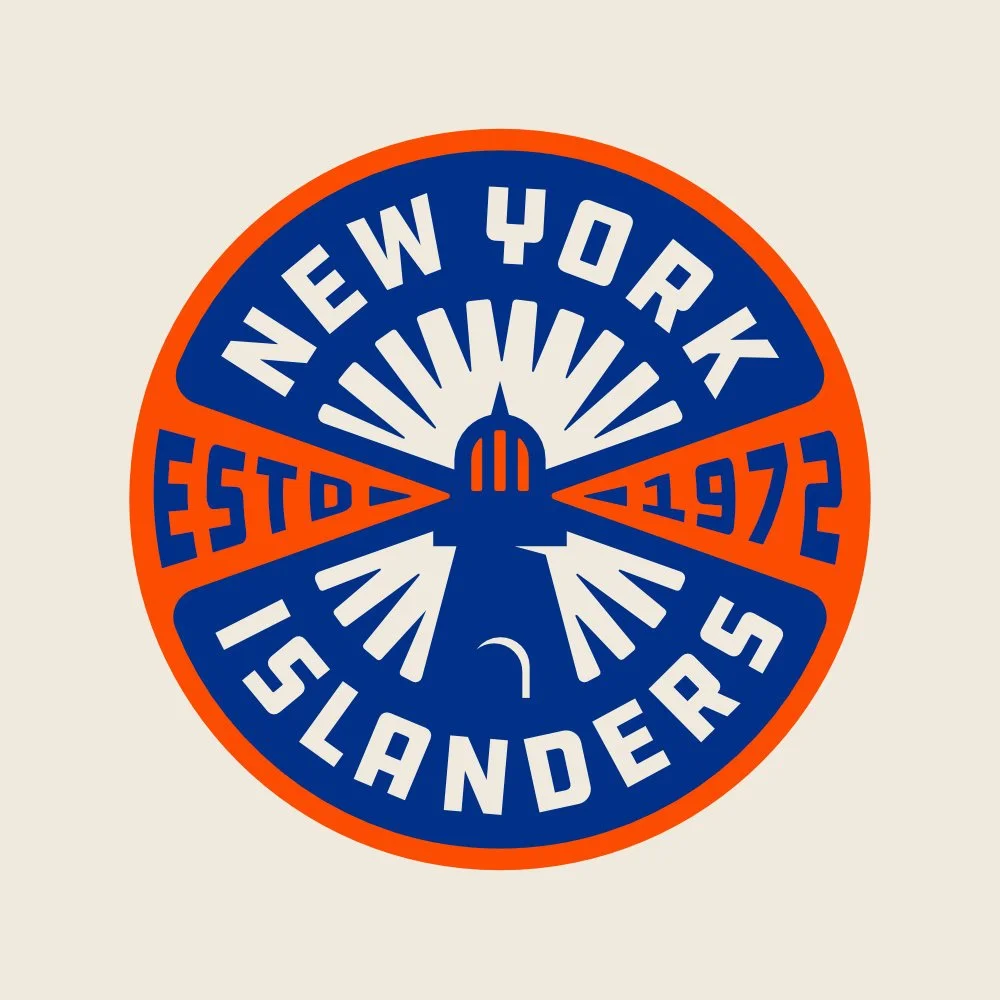
![Near-final New York Islanders concept logo by Luc Sauve with refined typography, lighthouse details, and updated colour balance]()
Refined Typography & Details
The changes at this stage were minor but made all the difference. I added rounded corners to improve flow, refined the lighthouse details, and tightened the typography.
-
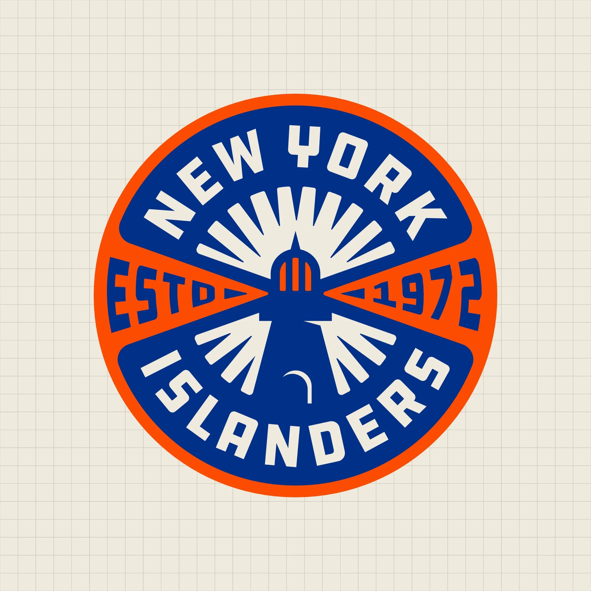
![Finalized New York Islanders concept logo by Luc Sauve featuring refined typography, lighthouse detailing, and bold colour balance]()
Final Design
To complete the design, I added light rays to the inner circle and simplified the lighthouse for a cleaner finish. Each stage brought small improvements that transformed a rough sketch into a polished badge.


Brand Elements
The Chicago Blackhawks lettermark is a perfect example of what I strive for when adding to a brand. With one of the most iconic and beloved logos in sports, it was crucial that this design felt like a natural extension of the team’s identity. Built around a bold “C,” the design seamlessly integrates the Blackhawks’ signature feathers, preserving a key element of the original logo. The result is a mark that feels both fresh and familiar.
Process below.
-
![Official Chicago Blackhawks logo featuring a Native American head profile with multicoloured feathers and classic NHL linework]()
Official Blackhawks Logo
The Blackhawks logo is one of the NHL’s most recognizable. It’s detailed, traditional, and full of colour. The feathers were the inspiration for my concept.
-
![Hand-drawn concept sketch by Luc Sauve for a modern Chicago Blackhawks logo, featuring a bold letter C and stylized feather elements.]()
Original Sketch
The first sketch combined a bold letter C with a simplified cluster of feathers. Right from the start, the goal was to reimagine the Blackhawks’ identity using cleaner shapes and modern symmetry.
-
![Early digital version of Chicago Blackhawks concept logo by Luc Sauve featuring a bold C and simplified feather shapes, closely resembling the final design.]()
Digital Iteration
The first digital iteration felt incomplete, like most early versions do. Still, it was surprisingly close to the final. The overall structure stayed the same from this point forward.
-
![Final version of Chicago Blackhawks concept logo by Luc Sauve featuring a bold C at the center, three simplified feathers in green, orange, and yellow, and black as the dominant background colour for improved visual balance.]()
Final Design
To finish the design, I pulled back the yellow and let black take the lead. This brought better balance to the overall colour palette.


Custom Lettering
The Tampa Bay Lightning wordmark is a great example of what I aim for for when evolving a team’s visual identity. It introduces something entirely new to the brand while maintaining a cohesive look. The challenge was creating the feeling of a lightning bolt running through the design without sacrificing readability. The result is a bold yet refined mark that stands out while fitting naturally within the team’s clean branding.
Process below.
-
![Official Tampa Bay Lightning Logo]()
Official Lightning Logo
The Lightning’s clean and simple logo was the inspiration for this concept. I wanted to carry that minimal, impactful feel into a custom wordmark that still captured the team’s energy.
-
![Hand-drawn Tampa Bay Lightning wordmark sketch by Luc Sauve featuring cursive lettering with a lightning bolt underline and bolt-shaped tail.]()
Original Sketch
The idea behind this sketch was to create the impression of a lightning bolt flowing through the letters, ending in a bolt shape at the tail of the word.
-
![Blue Tampa Bay Lightning wordmark design by Luc Sauve featuring clean custom script with a flowing lightning bolt underline.]()
Digital Iteration
This could have been the final design. The concept was executed clearly, with clean lettering and smooth flow. Sometimes, the design just clicks right away.
-
![Bold final Tampa Bay Lightning wordmark by Luc Sauve featuring thick outlined script and a lightning bolt underline, with inverted colors for impact.]()
Final Design
I wanted the wordmark to feel bolder and more powerful to match the energy of sports. I added a thick outline and inverted the colours to bring everything together.


Lettermark
The Ottawa Senators lettermark is a design that stands out for its concept rather than complexity. I always enjoy creating a lettermark for a team that has never had one and this was an exciting challenge. For this design, I incorporated the laurel motif from the team’s primary logo, weaving it into a custom Roman-style “S.” The result is a mark that feels historically rich while introducing something entirely new to the Senators’ identity.
Process below.
-
![Official Ottawa Senators logo featuring a Roman centurion profile in a gold helmet with red cape and laurel detailing]()
Official Senators Logo
The Ottawa Senators logo blends strength and tradition with its bold Roman imagery. One of the elements that stood out to me was the laurel detailing, which became the spark for my own concept.
-
![Sketch of a custom Roman-style letter S with laurel details for a modern Ottawa Senators lettermark concept by Luc Sauve.]()
Original Sketch
I sketched a custom Roman-style “S” with laurel details, aiming to create a lettermark that felt true to the Senators’ identity with a fresh perspective.
-
![Custom serif letter S created digitally by Luc Sauve as the foundation for an Ottawa Senators lettermark concept.]()
Custom Letterform
I brought the sketch into my computer and created a clean, custom letterform as the base of the design.
-
![Early digital iteration of a custom black and gold S letterform for the Ottawa Senators, featuring laurel detailing along the spine and edges of the design by Luc Sauve.]()
Digital Iteration
At this stage, things started to come together as I patiently placed each laurel detail to build out the concept.
-
![Final custom S lettermark for the Ottawa Senators by Luc Sauve, featuring bold black and gold lettering with laurel detailing and a red accent to reflect the team’s identity.]()
Final Design
I put the final touches on the design, making the letter more bold and adding a touch of red to highlight the team’s primary colour.


Modifying Type
The Buffalo Sabres wordmark is an example of how modifying an existing font can create something unique for a team. Using the font Dreamboat as the base inspiration, I designed a custom letter “B” that evokes the texture and flow of buffalo fur. From there, I carried this motif throughout the rest of the letters, adding subtle, organic details to give the wordmark a cohesive look that feels bold, dynamic and distinctly Buffalo.
Process below.
-
![Buffalo Sabres secondary logo featuring dynamic fur details that inspired Luc Sauve's custom wordmark design]()
Official Sabres Secondary Logo
For the Buffalo Sabres, I drew inspiration from their iconic secondary logo, specifically the dynamic flow of the buffalo’s fur. This element inspired the movement and energy in the new wordmark design
-
![Original sketch by Luc Sauve showing a custom letter B with flowing fur elements inspired by the Sabres logo]()
Original Sketch
In my original sketch, I focused on the first letter, infusing the dynamic movement of the buffalo’s fur into the letterform itself.
-
![Luc Sauve’s early process image combining a clean font with custom adjustments for the Buffalo Sabres wordmark]()
Base Font - Dreamboat
After designing the letter B, I selected a clean, existing font as a base for the rest of the wordmark. This allowed me to build on a strong foundation and then customize and refine it to match the overall vision.
-
![Final Buffalo Sabres wordmark designed by Luc Sauve, blending custom letterforms with stylized fur-inspired details]()
Final Design
In the final design, you can see how the base font and the initial sketch came together to create a custom wordmark. The flowing fur detail is now seamlessly integrated across the entire wordmark, giving it a unique and dynamic character.


Adding to an Identity
The Nashville Predators badge was a chance to break away from classic circular designs and explore a shape that reflects the team’s unique identity. Being a hockey team in the heart of the Music City, it felt natural to create a badge inspired by a guitar pick, giving it a subtle country music vibe. To tie it back to the Predators’ name, I incorporated the fangs of a saber-toothed tiger into the bottom of the design. The result is a badge that blends Nashville’s cultural roots with the team’s bold, fierce identity.
Process below.
-
![Nashville Predators secondary logo featuring a guitar pick with three stars, inspiring Luc Sauve's badge design]()
Official Nashville Secondary Logo
I drew inspiration from their secondary logo, which features a guitar pick design with the three stars from the Tennessee flag. This music city element inspired me to create a unique badge that reflects Nashville’s vibrant culture.
-
![Luc Sauve's original sketch of the Nashville Predators badge, featuring a guitar pick shape with a banner for typography]()
Original Sketch
In the original sketch, I experimented with laying out the typography within the shape of the guitar pick. I added a banner across the front to create distinct sections, dividing the space into a top, middle and bottom part.
-
![Structured badge design by Luc Sauve, showing refined proportions and clean sections for the Nashville Predators typography]()
Badge Structure
Building on the sketch, I refined the proportions of the badge, ensuring all shapes were clean and balanced. This provided well-defined areas for the typography and other design elements.
-
![Final Nashville Predators badge by Luc Sauve, with integrated typography and polished design details]()
Final Design
In the final design, I integrated the typography into the designated sections of the badge and made subtle adjustments to achieve a polished, cohesive look.


